Property
Living Room
Kitchen
Bar
Bedroom / Office
Master Bedroom
Master Bath
Automation
Solar
Backup Generator
Garage
RO System
Cooling & Heating
Back Yard

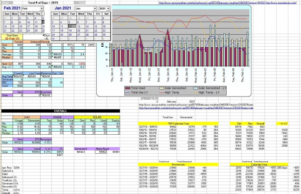
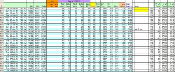
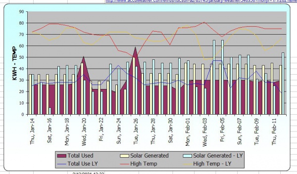
This graph, taken from the Analytics spreadsheet I created shows usage, from current and past year, along with Usage from current and past year. Also are the high temps. The images below show the daily readings, and the summary page. With the spreadsheet you can look at data from specific time periods, as well as yearly, TEP yearly and anniversary summaries.
I will certainly provide you with this document, and explain how to use it. I will also demonstrate how to use this data, and compare it to what TEP has recorded, as the goal is that the match up closesly.


